

colchester.gov.uk serves 185,000 residents each week in carrying out many self-serve transactions, inc; reporting missed bins, paying council tax, reporting anti-social behaviour, + many more!
In 2016, Colchester Borough Council made a move away from a previous website supplier which led to a rapid program of in-house design and development. During that time of speedy digital transformation, consideration for quality assurance, usability, web standards, accessibility, and user experience, was heavily sacrificed for speed of delivery.
My role(s): Digital Project Manager, Digital Designer
Project length: 18 months
With such a vast programme of work being delivered in such a short period of time, there were a number of issues with the website, notably to the usability and UX. But with 70 different service areas, 5,000+ web pages, and 4,500 inaccessible PDFs - where do you start?
I needed to bring stakeholders along the journey I was proposing. I was keen for the Council to move away from the 'big bang' approach to website design. Rather than rip up what had been done and go on a 2 year+ crusade to design and develop a new site, I suggested that we approach the project in an iterative manner.
This iterative manner began by highlighting patterns across the site; recurring page types, transactions, processes, and user journeys. Improving these patterns would make highly noticeable changes to the website. We also analysed customer feedback in combination with website analytics, so we could prioritise (a) where the most pain for customers was, (b) where the most pain/contact was for the organisation, and (c) where improvements would have the biggest impact - this created our roadmap.
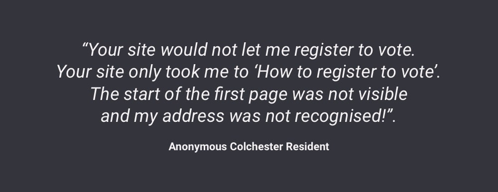
Customer feedback
Feedback was measured at 90% negative for CX
A pattern library was developed in order to create much needed consistency that was not previously present. As an example, during a review of the website, we recorded 15 different action styles (buttons and links) on a single page - this inconsistency in usability results in customers having to work extremely hard to know where to interact with the site.
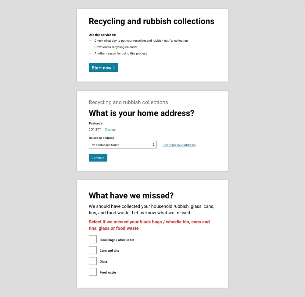
Pattern library
Self-serve transactions and processes
We consciously and blatantly took inspiration from the Gov.uk design system which GDS actively encourage. Central Government have spent a lot of time and money to create a design system (and service language) that meet the needs of customers. Rather than ignore their learnings and start again, we intelligently used the Gov.uk design system to inform our own.
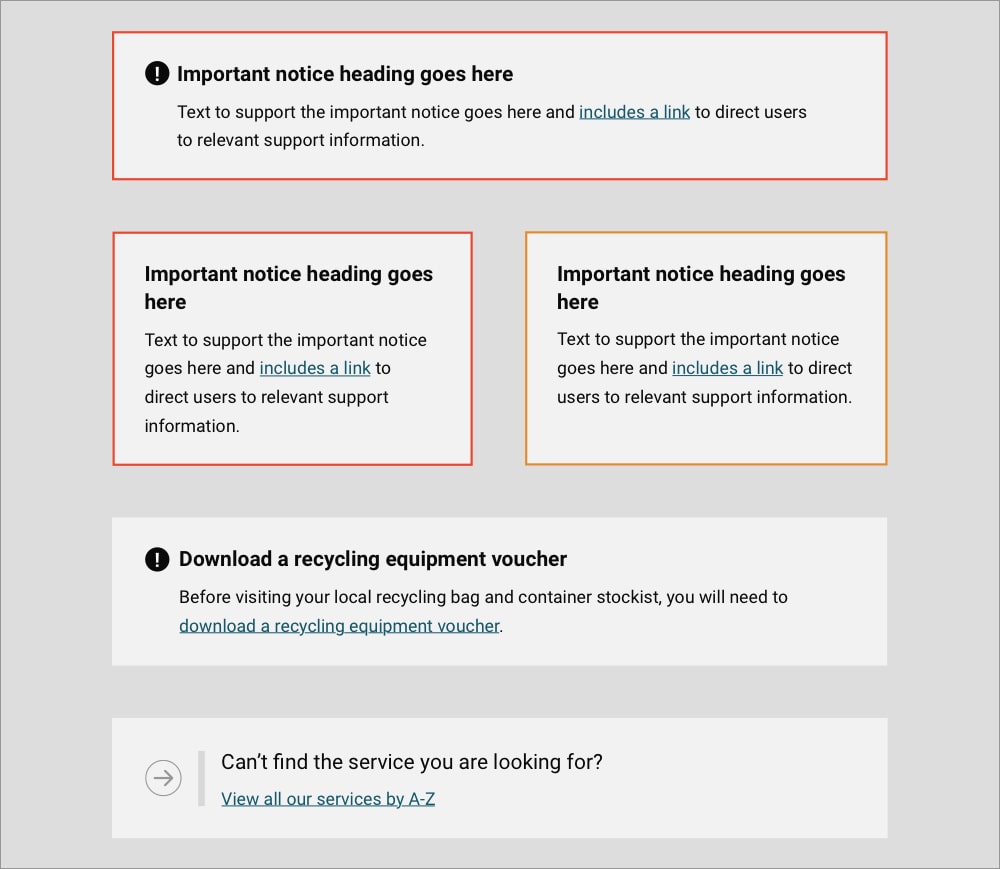
Pattern library
Notices, updates, and messages
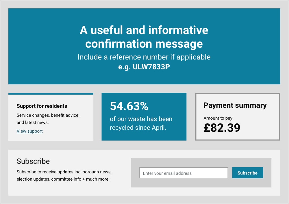
Pattern library
Cards, confirmation messages, and subscriptions
This pattern library has improved the usability of many self-serve transactions as well as drive improvements to the web templates used for presenting information to customers. A number of landing pages, series and content pages have been created to roll out to the 5,000+ pages on colchester.gov.uk as part of the overall implementation roadmap.
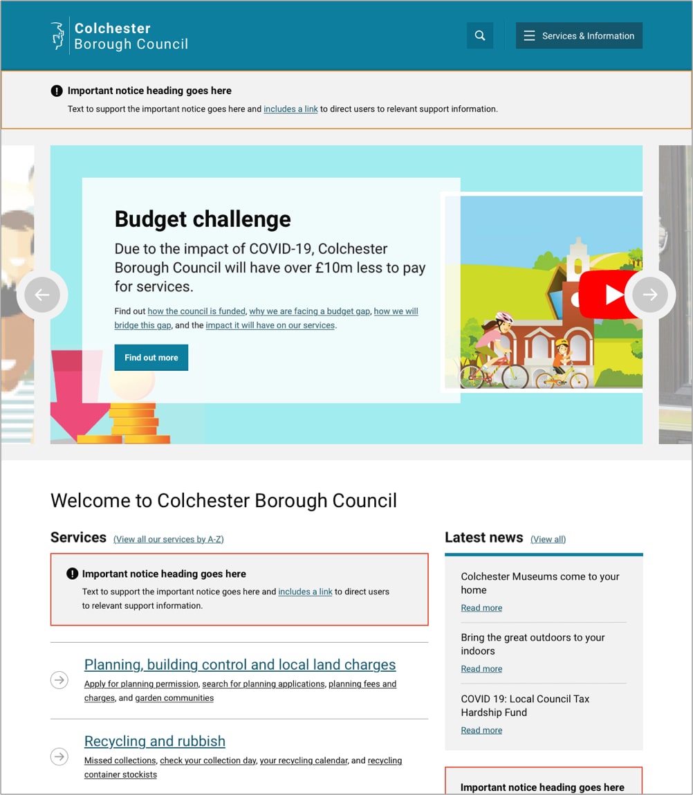
Page template
Home page
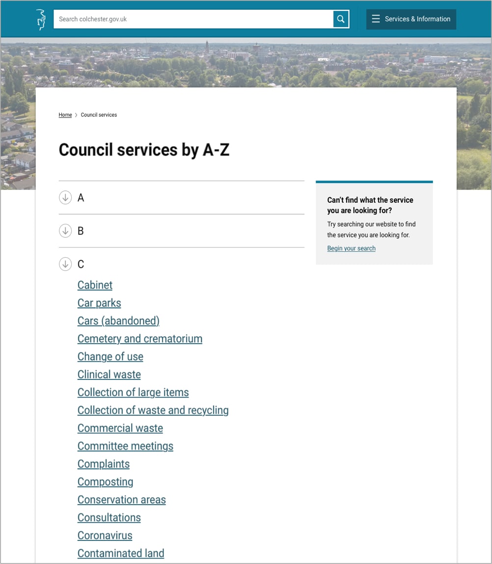
Page template
Services listing page
With 70 different service areas, this project had 70 different stakeholders. This was a lot to manage but I learnt the importance of having a roadmap laid out at the start, not only to communicate the stages of implementation, but to also communicate the overall strategy, vision and goal of the project. In addition to a roadmap, we also defined a set of digital principles that we would ensure the project adhered to.
With the roadmap and principles created, we were able to communicate and involve the project stakeholders whilst managing their input carefully. This has been so important on this project due to the scale and breadth of the Council’s different service areas.
Alleviating pressures on A&E
Improving the care and experience of patients visiting A&E.